The Challenge
BRLink is an IT company that offers cloud computing services in the enterprise servers segments, virtualization and consulting. Our main challenge on the new visual identity development, was to create a logo where the typography spoke for itself. The concepts that the new logo should express was modernity, trust and seriousness.
PT. // O Desafio
A BRLink é uma empresa de TI que oferece serviços de cloud computing nos segmentos corporativos de servidores, virtualização e consultoria.
Nosso principal desafio no desenvolvimento da nova identidade visual, era criar um logo onde a tipografia falasse por si só. Os conceitos que o novo logo deveriam expressar eram modernidade, confiança e seriedade.
Solution
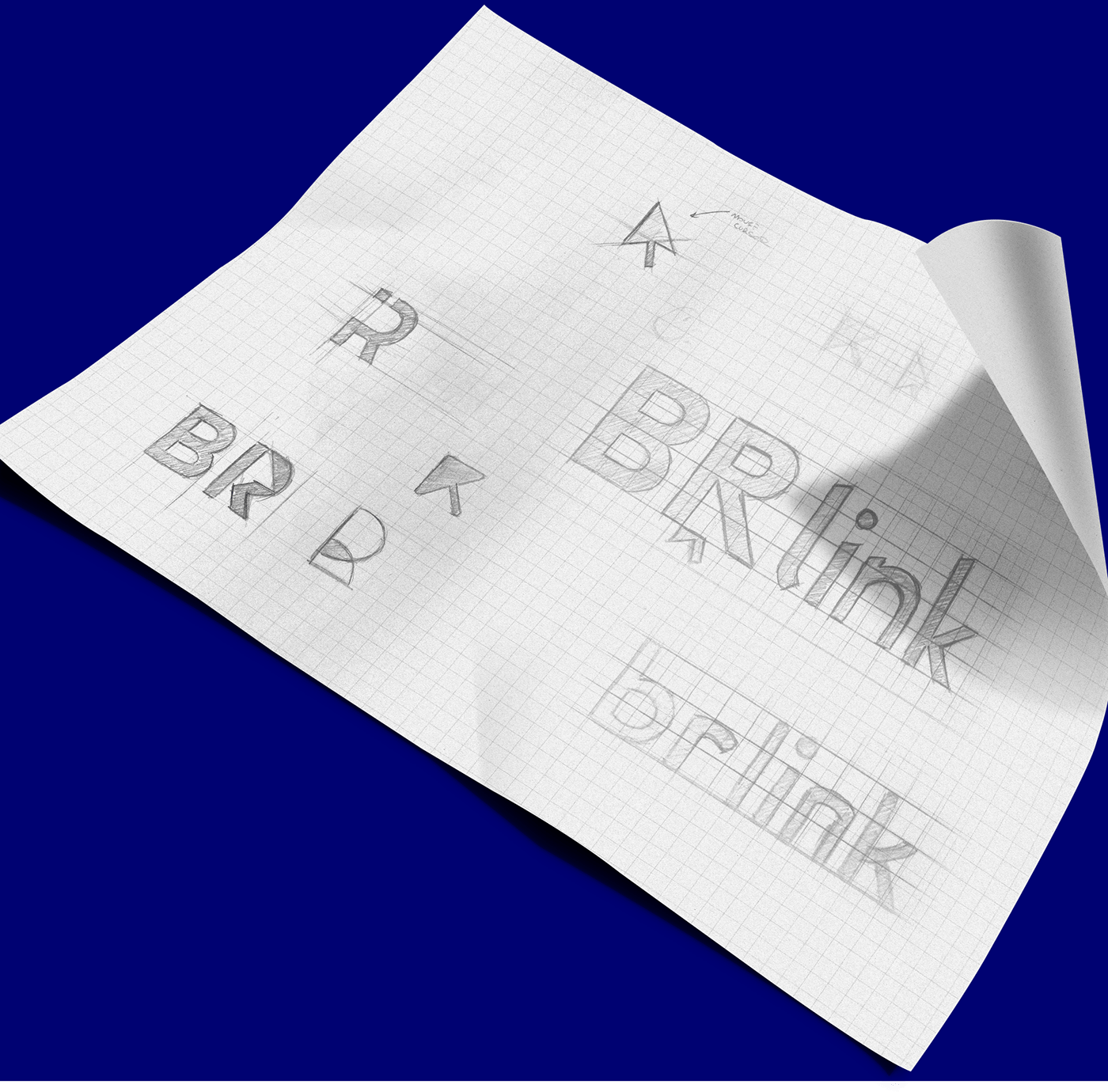
We had to think about something that initially remit to technology. Something that was modern and easy to identify in everyday life consumer, thus seeking to make the idea that BRLink is a friendly company and always open to its customers. We decided that the best representation would be a mouse pointer, but inserted in the
typography negatively because it we could not have an archetype in that logo. The mouse pointer refers to a computer, which is the main element that refers to technology.
typography negatively because it we could not have an archetype in that logo. The mouse pointer refers to a computer, which is the main element that refers to technology.
We insert this pointer negatively in the letter "R", thus highlighting the letters "BR" to avoid phonetic conflict at the Company's Name pronunciation. The word "link" was included in lower case and with the font thickness a little thinner, again "separating" from the acronym BR and strengthening the correct pronunciation of the name. The typography was designed from the drafts in order to be built on top of a graphical mesh based on the golden ratio. The golden ratio is a real algebraic constant irrational, which is considered a perfect spiral pleasing to the eye, that's why is used as the basis for the brand so it becomes more attractive to the eyes.
PT. // Solução
Precisávamos pensar em algo que remetesse inicialmente à tecnologia. Algo que fosse moderno e de fácil identificação no cotidiano do consumidor, buscando assim transparecer a ideia de que a BRLink é uma empresa amigável e sempre aberta à seus clientes. Decidimos que a melhor representação seria a de um ponteiro de mouse, mas inserido na tipografia de forma negativa pois não poderíamos ter um arquétipo nesse logo. O ponteiro de mouse remete à um computador, que é o principal elemento que remete à tecnologia.
Inserimos esse ponteiro de forma negativa na letra "R", dando assim destaque as letras "BR" para evitar o conflito fonético na pronúncia do nome da empresa. A palavra "link" foi incluída em caixa baixa e com a espessura da fonte um pouco mais fina, novamente "separando" da sigla BR e fortalecendo a pronúncia correta do nome. A tipografia foi pensada desde a fase de rascunhos de forma a ser construída em cima de uma malha gráfica baseada na proporção aurea. A proporção áurea é uma constante real algébrica irracional, que é considerada uma espiral perfeita agradável aos olhos, por esse motivo é utilizada como base para a marca ficar mais atrativa aos olhos.


Iconography
Some icons have also been developed for complementary uses at visual identity and brand communication.
PT. // Iconografia
Foram desenvolvidos também alguns ícones complementares para utilizações em ítens da identidade visual e comunicação da marca.

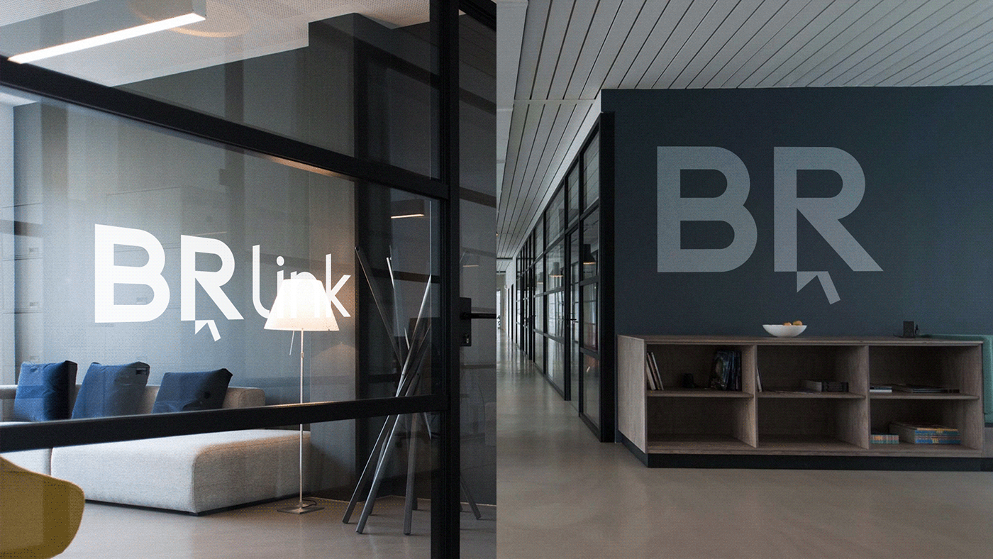
Mockups and Applications
Here it is possible to see how the identity unfolds in different parts, making the company communication and the graphic system robust and consistent.
PT. // Mockups
Aqui é possível perceber como a identidade se desdobra em diferentes peças, tornando a comunicação da empresa o e sistema gráfico robusto e consistente.